
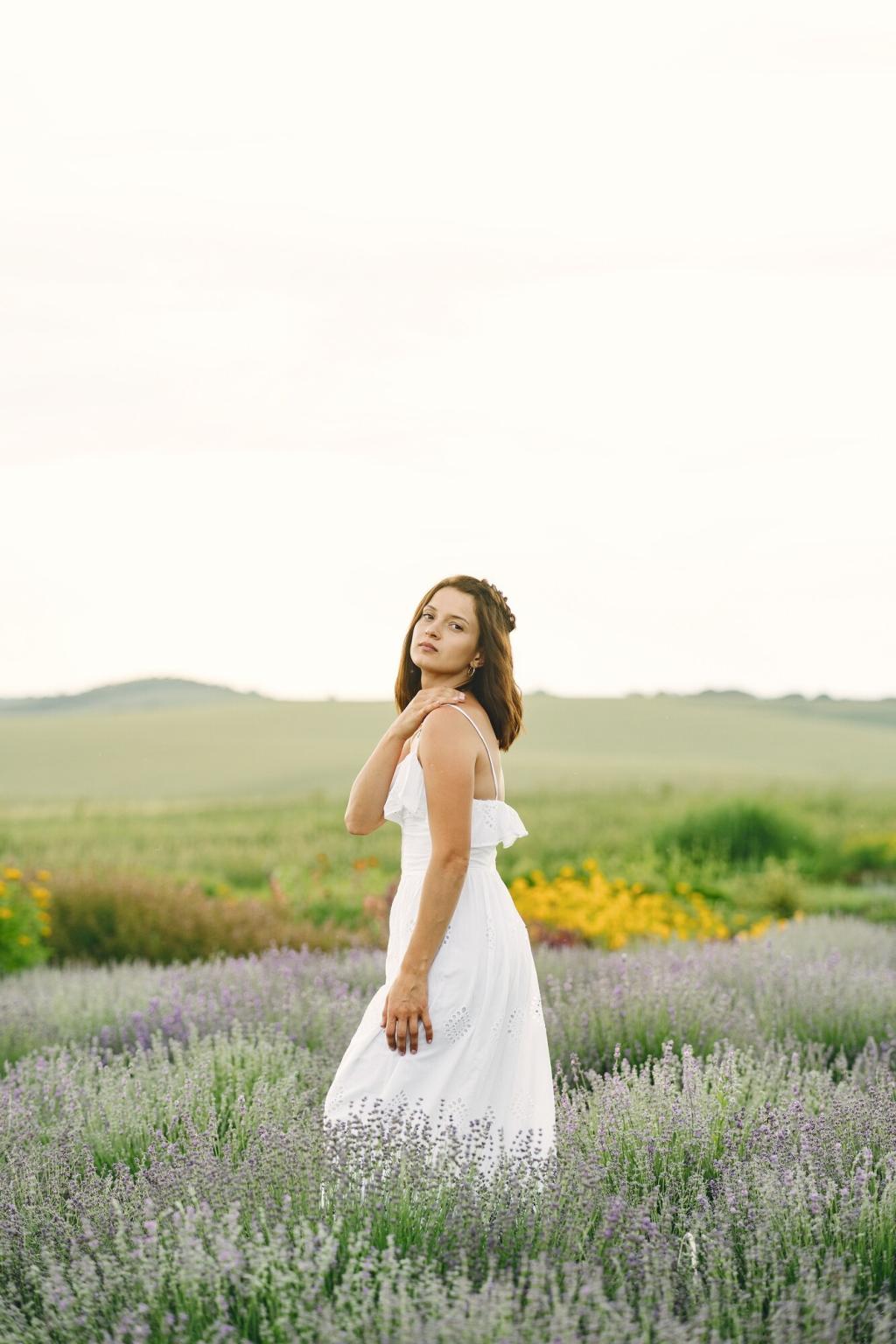
Color Contrast and How We See Art
Chosen theme: Color Contrast and Its Impact on Visual Perception in Art. Step into a world where edges sharpen, emotions rise, and meaning emerges through differences in light, hue, and intensity. Read, experiment, and subscribe to continue exploring contrast together.
Our vision relies on three cone types and opponent channels, comparing red against green and blue against yellow, while luminance detects edges. These comparisons heighten contrast, making borders seem crisper, focal points brighter, and low-contrast areas recede gently into background atmosphere.
The Science Behind Contrast
Chevreul showed that a gray swatch appears warmer beside blue and cooler beside orange. Stare at a red square, then look away, and a green afterimage blooms. Artists exploit this phenomenon to energize surfaces and guide attention without obvious lines or arrows.
The Science Behind Contrast
Chiaroscuro and Caravaggio
Caravaggio’s high value contrasts carve figures from darkness, turning scenes into stages where moral choices feel immediate. Harsh light, deep shadow, and tight compositions compress space so our perception locks onto faces and hands, amplifying narrative tension and human vulnerability.
Impressionists and complementary vibration
Monet and Seurat placed complements side by side, letting the eye mix them optically. Orange beside blue, red beside green, they discovered subtle vibration that seems to shimmer. This technique increases perceived brightness without overworking paint, inviting lingering, attentive looking on sunlit surfaces.
From Itten to Albers: teaching contrast
Johannes Itten cataloged contrast types, from hue to temperature to saturation. Josef Albers revealed how color changes with neighbors in Homage to the Square. Their exercises remain essential, reminding us perception is relative; context can make identical colors appear startlingly different.
Reserve your highest light and deepest dark for the subject. Reduce competing contrast elsewhere by grouping midtones. This simple strategy guides viewers instantly, even at a distance. Try squinting to check value design, and comment with a snapshot of your thumbnail plan.

High contrast for drama and urgency
Sharp edges, bright highlights, and deep shadows can feel like thunder. High contrast broadcasts clarity, conflict, and decisiveness. Use it when you want the viewer to act, gasp, or lean closer. What scene in your life deserves such a bold, high-contrast treatment today?
Low contrast for intimacy and ambiguity
Close values soften edges, suggesting fog, memory, or tenderness. Low contrast invites slower looking, encouraging interpretation. It is ideal for meditative works, nocturnes, and whispers of narrative. Try a limited palette tonight and tell us how your mood shifted while painting.
Symbolism, culture, and meaning
Color meanings vary across cultures, but contrast reliably signals emphasis and hierarchy. Designers blend cultural color knowledge with universal contrast cues to avoid misreadings. Share examples from your context, and help us build a community glossary of contrast and meaning.
Contrast for Accessibility
Legibility standards and quick checks
On screens, the WCAG suggests contrast ratios like 4.5 to 1 for normal text and 3 to 1 for large text. Check your graphics in grayscale to validate hierarchy. These small habits help more people read comfortably, particularly in bright environments or aging eyes.
Lighting, glare, and exhibition choices
Museum lighting balances protection with visibility by tuning illuminance, glare, and background value. A painting with subtle contrasts benefits from neutral walls and controlled reflections. Consider how your display context alters perceived contrast, then share photos of your setup for feedback.
Designing for color vision diversity
Avoid relying on hue alone. Separate elements with value, pattern, and shape, and test with simulators for deuteranopia or protanopia. Many artists discover stronger compositions when forced to clarify contrast channels. Comment with your favorite tools and presets that keep audiences included.
Practice Routines to Master Contrast
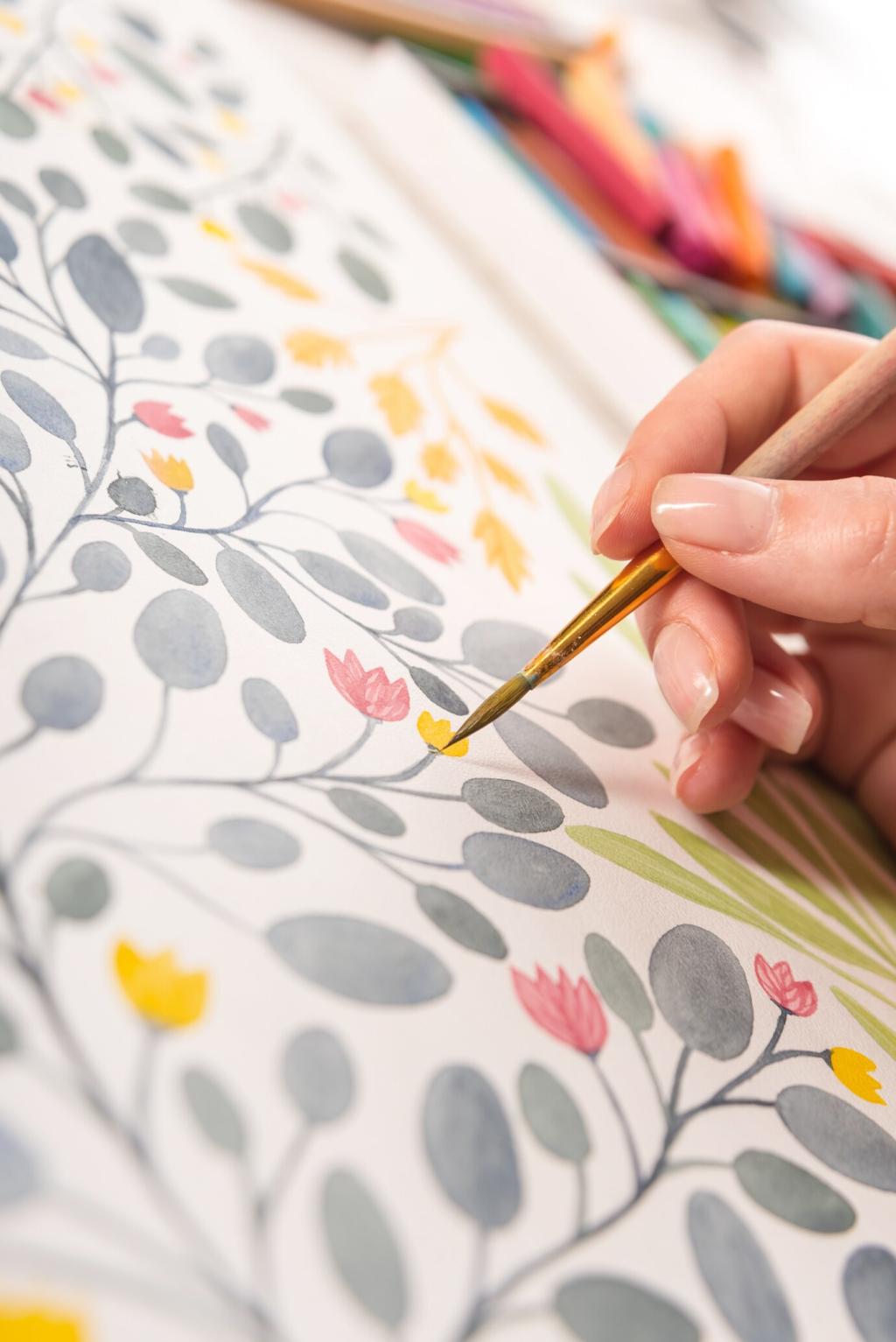
Reduce any reference to light, mid, and dark. Paint or sketch using only those steps. This constraint clarifies design instantly. Post your tri-value study and tag our community; we will feature clear, readable examples in next week’s newsletter and discussion.
Stories From the Studio
After hours of struggle, a painter lifted the background value two steps, and suddenly the portrait breathed. The same colors appeared brighter, edges separated, and the sitter’s glance felt alive. Tell us about your own midnight fixes sparked by a simple contrast shift.

Stories From the Studio
A curator moved a low-contrast landscape onto a cooler gray wall, reducing glare and boosting legibility. Visitors paused longer, noticing distant sailboats previously overlooked. Context reframed perception. Share your display experiments and how wall tone or lighting altered what viewers discovered.