Welcome to our deep dive into Analyzing Color Palettes of Famous Paintings, where we decode iconic hues, reveal hidden harmonies, and transform legendary brushstrokes into practical insights for creators, learners, and curious art lovers.
Why Color Palettes Shape the Story of Art
From a distance, a painting’s palette sets the mood before any subject is recognized. Warm clusters read like crescendos; cool fields become pauses, silence, and breath. Share a painting that changed your mood instantly.
Why Color Palettes Shape the Story of Art
Artists orchestrate harmony and contrast to emphasize what matters most. A single pop of cadmium red amidst tranquil blues can pull attention like a lighthouse. Comment with examples where one color dominated your attention.
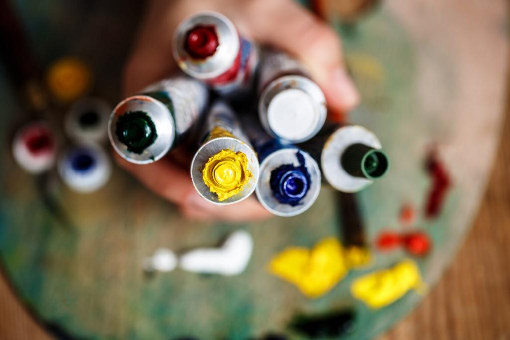
Practical Methods: Extracting Palettes Like a Pro
Start with timed observations: two minutes for first impressions, five for dominant hues, ten for transitions. Sketch swatches with colored pencils. Post your notebook snapshot and tag your three most surprising hues.
Practical Methods: Extracting Palettes Like a Pro
Use a calibrated monitor, eyedropper tools, and histogram views to sample generously, not sparsely. Cluster samples into families, then refine. Share your five-swatch summary and explain the logic behind each selection.
Case Study: Van Gogh’s Starry Night — Turbulent Blues, Courageous Yellows
Van Gogh layers cobalt and ultramarine to build atmospheric depth, then streaks lighter blues like gusts. Those swift transitions feel like breath speeding up. Have you felt a sky vibrate in person? Describe that moment.
Case Study: Van Gogh’s Starry Night — Turbulent Blues, Courageous Yellows
The moon and stars blaze with chrome yellow, puncturing the blue field like heartbeat monitors. That bold, hot pulse organizes the entire scene. Try isolating his yellows and report how the mood weakens or strengthens.
Frida Kahlo — Palettes of Pain, Pride, and Symbol
Frida’s greens feel medicinal and mystical, a bridge between body and myth. Sample three distinct greens across one painting and name each for its role—healing, warning, memory. Ask readers to refine your naming.
Choose one masterpiece and distill five swatches: dominant base, counterpoint accent, shadow hue, light hue, and neutral mediator. Post your set and why each swatch earns a specific job in your design.
Apply Classic Palettes to Your Work
Legendary palettes must still read on screens and signage. Measure contrast ratios and simulate color vision differences. Share before-and-after screenshots and invite feedback from readers using assistive technologies.